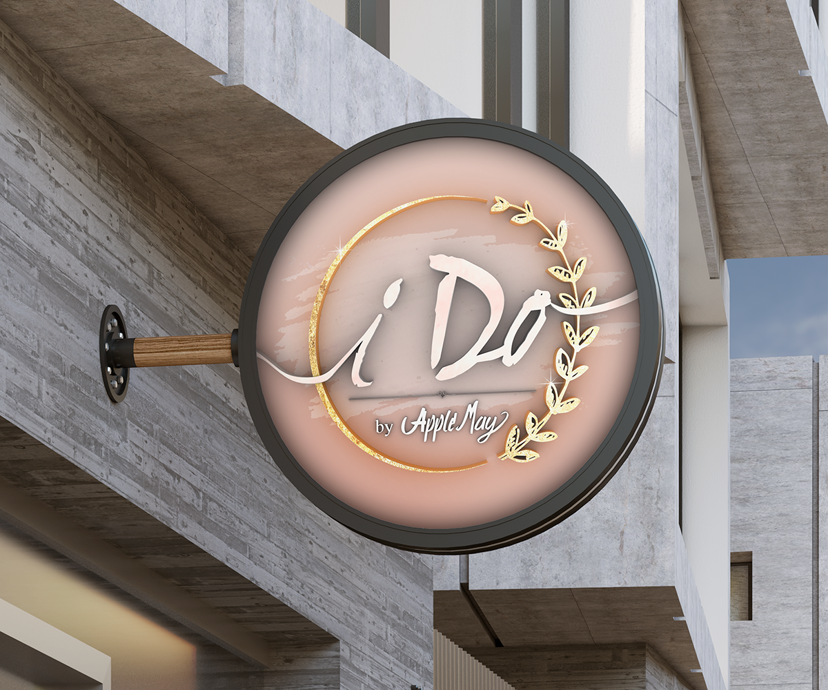
The Process
The store was an upcoming wedding accessory store with little direction other than the desired colors. I drew inspiration from the timeless symbol of weddings – golden rings – as a foundation. However, I aimed to imbue the brand with more depth than a simple gold circle. Upon reviewing the upcoming product designs, which leaned towards a shabby chic style, I incorporated subtle yet enduring elements like delicate leaves.
Beneath the whimsical and elegant script font, I introduced a minute but meaningful detail – a tied knot – to create a visual distinction between the business title and the creator's name. To bring this entire design to life, I transformed it into a 3D object using Photoshop, meticulously adjusting the lighting until I achieved the perfect balance, ultimately culminating in a striking 3D render.
Letter initials for the logo.


Another logo design with client initials.