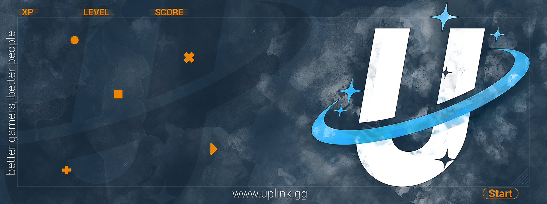
The business client already had the branding design and color palette for me and requested a mousepad design for their local ESports business that consists of mainly kids/teenagers. The client wasn't sure about the direction he wanted to take for the Mousepad design. So I quickly drew up some samples to see what he did or didn't like.


From there we discuss what he liked about each image or what he didn't like. This helped me gauge what direction he wanted to go. He complimented the white design in one image but enjoyed the geometric shapes of another image. So I decided to combine the two but took into consideration that the pads would be used by children, and therefor a solid white - or even a light - background would be disastrous. I decided to keep the background somewhat dark, but work in some lighter components, but always keeping a sort of dusting texture over light areas.

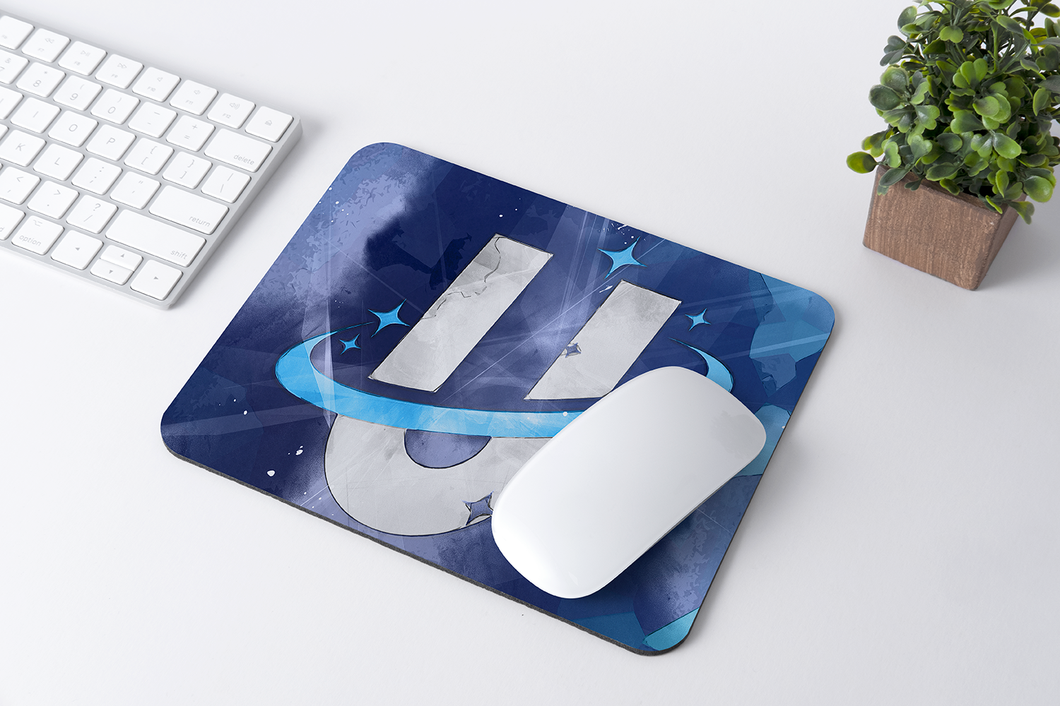
The final design for the wide MousePads: