Fixit Construction LLC: Elevating a Brand Beyond the Blueprint
1. Background: The Initial Ask
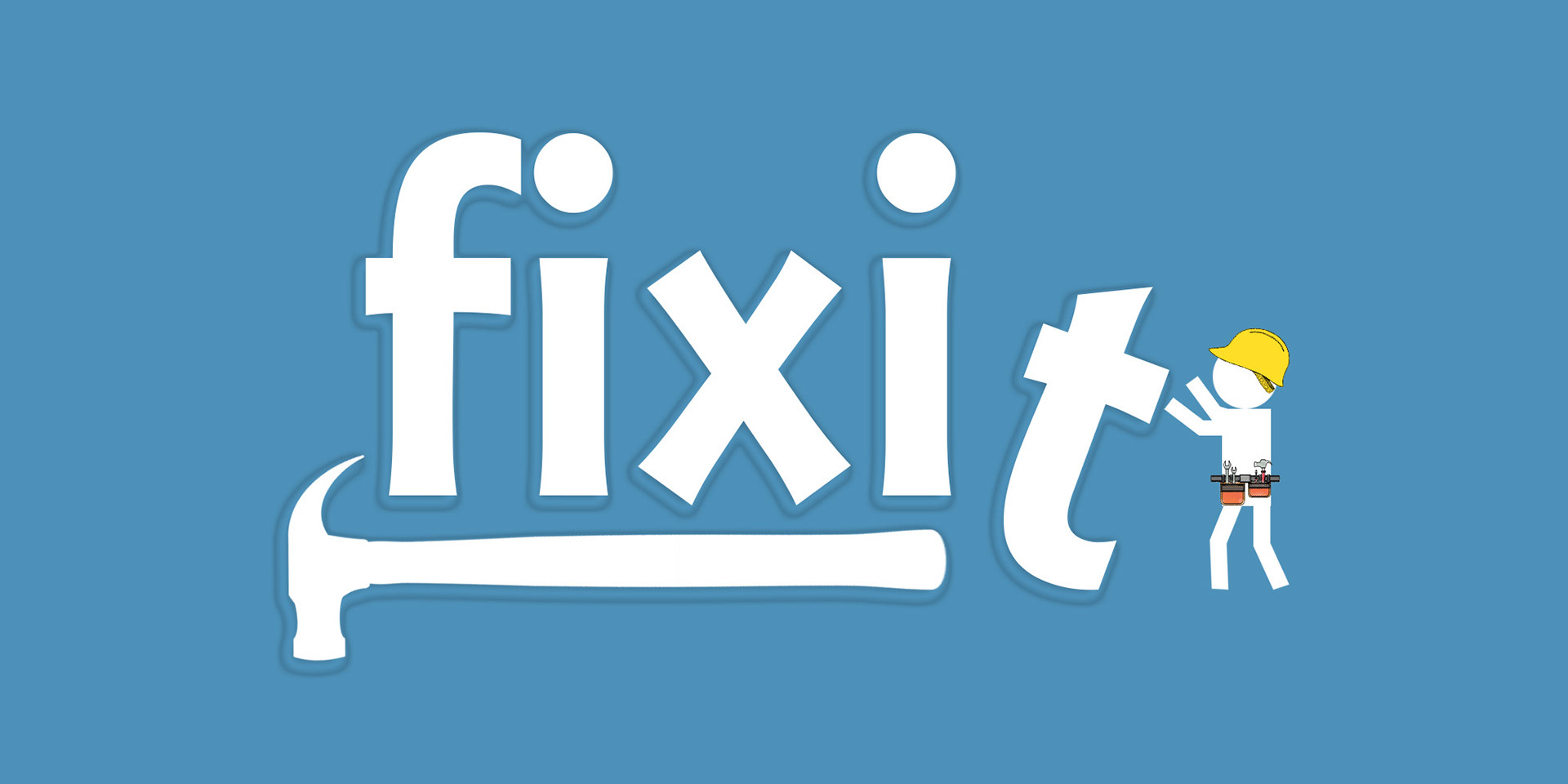
When Fixit Construction LLC approached me, the client had a clear vision—or so he thought. He wanted a playful, cartoon-style logo, imagining something light-hearted that would appeal to potential customers and include a hammer. However, after discussing his business in more depth, I realized this direction didn’t align with his work. Fixit was much more than small-scale handyman services—they specialized in large, high-end construction projects for executive-level clients. It became clear that a cartoon logo wouldn’t reflect the level of sophistication his clients expected, and more importantly, it could actually misrepresent the business.
2. The Misalignment Between Vision and Reality
The real challenge was figuring out how to gently steer the client away from his initial concept without dismissing his input. While the client envisioned a playful, approachable image, I realized it could potentially downplay the scale and quality of his services. The cartoon logo might have been fun, but it risked positioning Fixit as a handyman brand, not the full-service contractor they truly were. My task was to craft a design that would capture the professionalism and expertise his target audience—high-end, sophisticated clients—would expect, while still acknowledging his original idea.
3. Research and Rethinking the Approach
To support this shift in direction, I began by researching local competitors and branding trends within the construction industry. I noticed a common theme: many contractors were branding themselves with their own names, often accompanied by cartoonish logos depicting themselves with tools. While this was effective for small, residential handyman services, it wasn’t right for Fixit’s broader scope. My conversations with the client had made it clear that his brand needed to stand apart—reflecting a higher level of expertise and professionalism.
With this insight, I created two concepts: the first, a playful, cartoon-style design in line with his initial request, and the second, a more polished, modern logo that I believed would better represent his business and resonate with his target clientele.
4. The Pivotal Moment
When I presented both designs, there was a brief pause. The client carefully considered each option, and almost instantly, his attention shifted away from the cartoon design. He quickly recognized that while fun, it didn’t reflect the kind of work or the level of clients Fixit was aiming for. The more refined logo, on the other hand, immediately resonated. It struck the perfect balance between professionalism and approachability—a strong, clean design that communicated trust and quality.
5. Refining the Vision
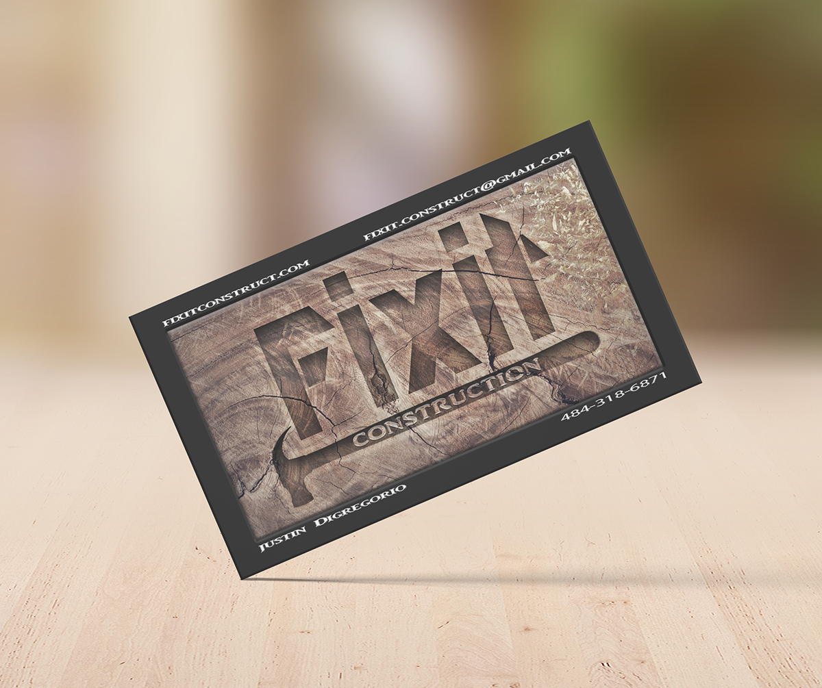
With the client on board with the more mature direction, we worked together to refine the design. We opted for a sleek, minimalist look, using a color palette that evoked reliability—deep, earthy tones paired with sharp, clean lines. The final logo subtly conveyed both strength and elegance, positioning Fixit Construction as a top-tier service provider without feeling overly formal or unapproachable.
6. A Brand That Truly Represents the Business
The final result was a brand identity that elevated Fixit Construction far above its competitors. The new logo reflected the company’s expertise, aligning perfectly with the upscale clients they were targeting. The business card design in particular was a standout—clients regularly commented on its professional, polished appearance. Not only was the client thrilled with the outcome, but the new branding has since become a key part of how Fixit presents itself in the market.
Conclusion
This project was more than just designing a logo—it was about repositioning a business to reflect its true capabilities. By balancing the client’s initial ideas with my strategic direction, we were able to create a brand identity that didn’t just meet their needs but also set them up for long-term success. The best part? We found a design that felt authentic to the client while resonating with the audience they wanted to attract.
The branding didn't end there, check out Fixit's web design project here.