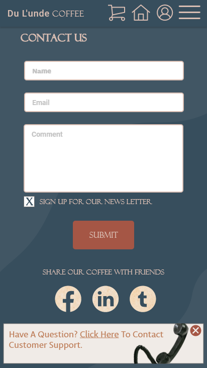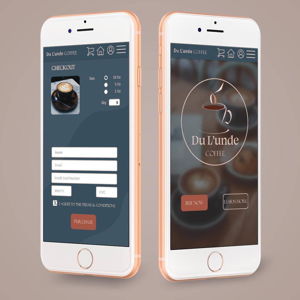
App design for a fictitious coffee cafe.
The Process
The coffee cafe app described above was meticulously crafted, with a persona generated at random to drive the project. My approach was to treat the project as if it were intended for handoff to a client, adhering to the standard methodology throughout its development.
1. Research
The research was conducted on local coffee shops to analyze the website design and user flow before reaching out to fellow coffee addicts who were kind enough to let me interview them. Three key points seemed to stand out most in my research:
A. Accessibility
"There aren't enough local cafes that deliver, or at least, let me order ahead when I'm already in a bind for time"
B. Calming Style
"When you're ordering coffee, you're tired, right? So the style should be something that's calming to the eye and not straining my vision."
C. Nothing Complicated
"Usually, when I'm trying to get a cup of Joe I'm already short on energy for brain power. A coffee app should be easy to navigate and just let me order what I want."
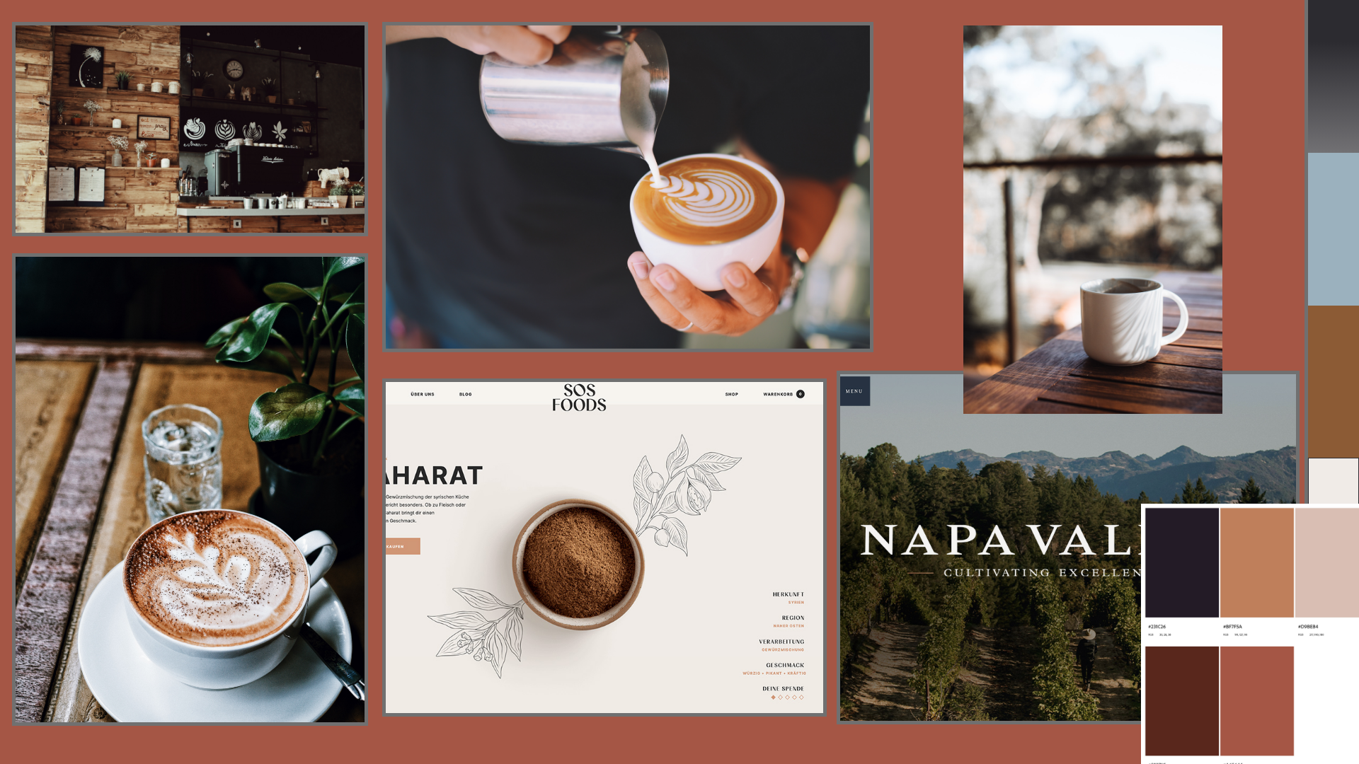
After reviewing several websites and engaging in conversations with locals, I made the decision to construct a mood board. This mood board would serve as a wellspring of inspiration, guiding the app's style and influencing the choice of color palette.
2. Brain Storm & Strategize
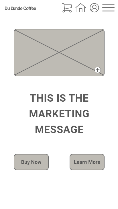
With my mood board sprawled out above my workspace, serving as a constant source of inspiration, I delved into contemplating the app's layout. I tried to take into consideration the results of my user interviews and first created the flow chart before moving on to the wireframes. I laid out several frames inside Adobe XD and got to work.
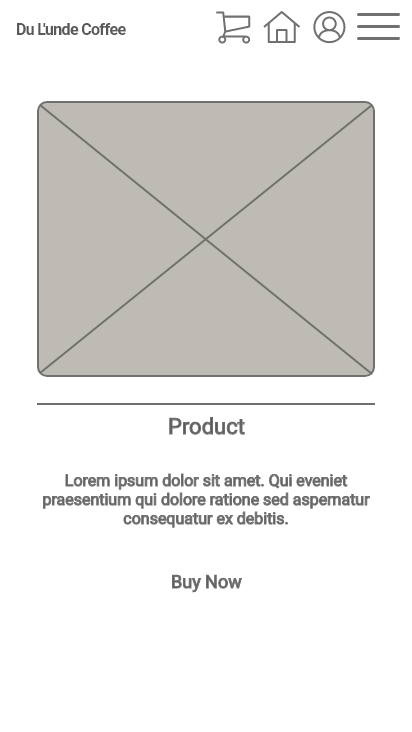
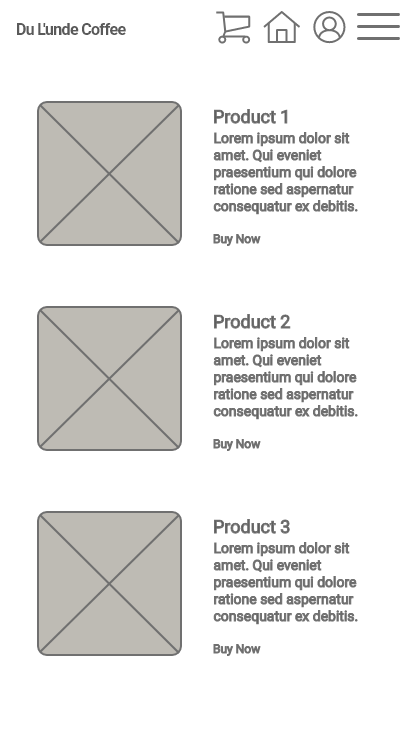
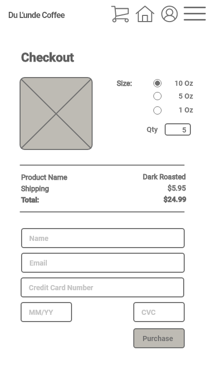
3. Design
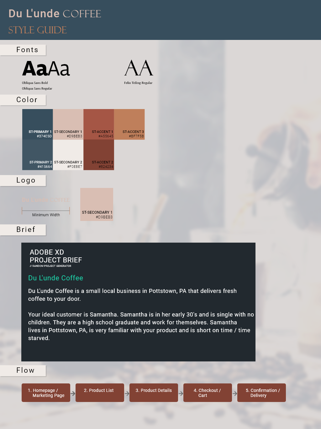
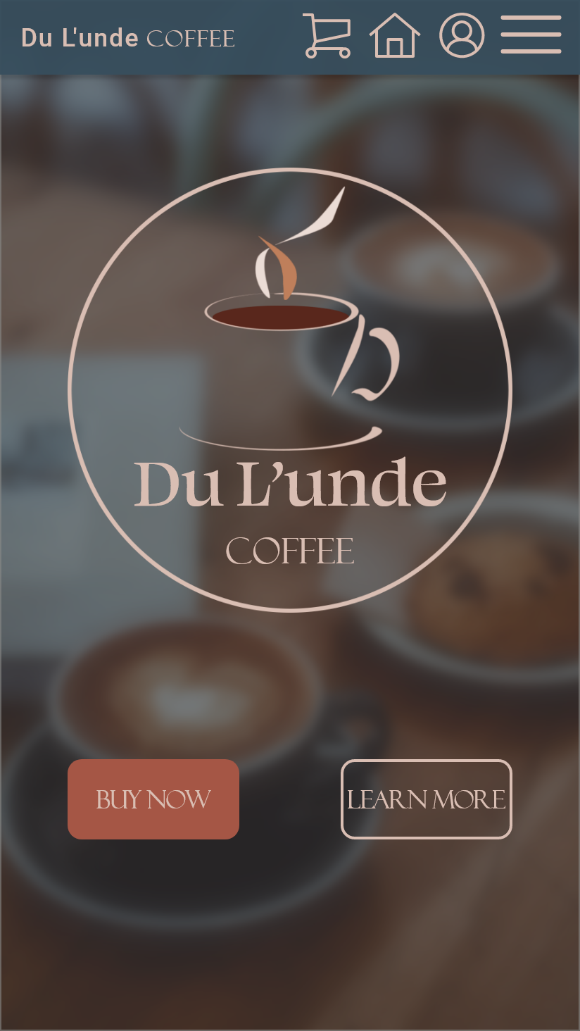
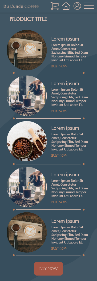
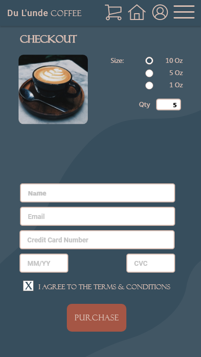
Drawing inspiration from my mood board, my aim was to infuse the app with a sense of relaxation, achieved through a rich palette of deep, earthy colors. In designing the logo, I strived for a delicate and unobtrusive appearance, mindful of the limited screen space on which it would be viewed. Recognizing that it's the small details that often make an app exceptional, I incorporated subtle color transitions when hovering over buttons. This feature not only adds a touch of interactivity but also transforms the app from a static page into an engaging interface eagerly awaiting user input.